Card overview experiments

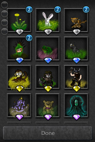
As there are more and more cards being added to the game, I'm currently experimenting with a new user interface that will provide a better overview. Currently I've implemented this for towers and items, the two types of cards that tend to grow a lot in a game. The new layout would become active once a deck contains more than 7 cards. What do you think? Will this make selecting stuff more comfortable? PS: I'm going to add this experiment to the next beta version, so you can give it a try if you want!

Looks pretty good to me! I like the Overview pretty much! :) Do we have to scroll down (seems like) or do we swipe as usual?

Will it be organized like that, with 1 page for each element? That would be a nice way to organize them.

@Marzipain - oh, good call! I've implemented the MVP as a vertical scrollview. Now I know why it felt so odd, to scroll down instead of swipe :-D I guess swiping might feel a lot more natural. Gonna try that out today. Thanks .-) @FuzzyEuk, no that isn't planned. For a future version it could be possible to add filters to the bottom though (rarity, element).

How to transmute a card in this view? I would think 3x3 would be enough giving you the option for some bonus field on the bottom for things like filter or sorting options.

@Kami, currently when you click on a item on the grid you enter the 'regular' card view where you can transmute. In the grid, swipe up doesn't really work, same goes for double tap (since tap goes to single card view). Gonna try a long press now :-)

My subjective opinion: I like the feeling of a deck of cards. Yes, the grid is more functional, but part of the atmosphere is lost. Can the grid be made optional?

In the current beta the grid only appears once you have more than 7 cards in that deck. Would that work for you?

Having a toggle for it in the options might not be the worst idea.