Level design
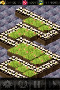
Today I was playing around with the post-production of the tower defense map. It's somehow the central part of the game and something players will look at quite a lot. So I just thought I'm asking for your opinion on it. Which one do you like more? Design with Sepia Look
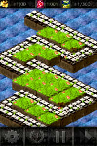
 Design with Bright Look


