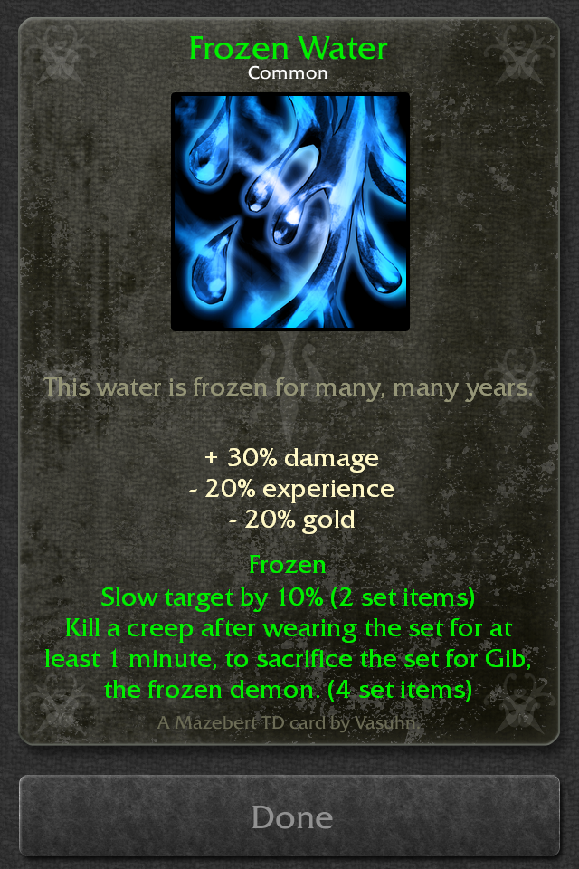
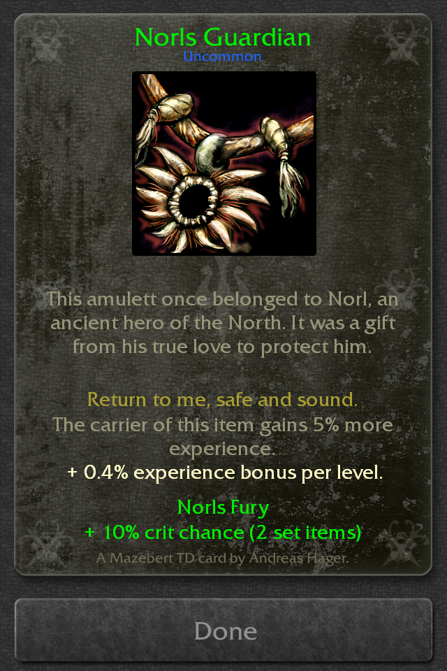
I didn't like the new look of set item cards from the start.
At first I thought I just need to get used to it. But after some good nights of sleep I still don't like it. It simply doesn't feel like a special set item anymore.
I updated the layout again and this time I like it from the start :-)
What do you think?
In terms of consistency this would probably the best. But on the other hand it's a bit redundant information. and might clutter the look of the cards.
To get it really consistent I should also add it to tower and potion cards.
To be honest I haven't made up my mind about it yet :-D
Any other opinions on this?
Sorry for the late reply Andy. I've been uber sick and am finally out of bed for the first time since Thursday. That all said and done let's move on to serious stuff :)
I believe the redundant nature may actually be helpful for many people, Everyone processes and remembers differently,
Alternately, you can just do like the card trading games and place a small circle icon either top left or bottom left which is color coded and letter coded to the rarity. Eg. a small white c for common, a green u, a yellow r and perhaps use Un for unique.... That will display the information and the color and not clutter it all up. Hehe your'e a programmer you should know better than to try to reinvent the wheel ;)