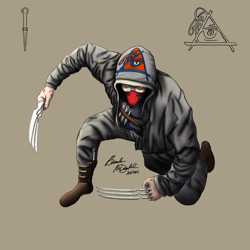
The Ripper Redesign
Didn't much like the design of the previous ripper piece so I started back from the line art sketch and redesigned him. Which version do you guys like better? Also the way I layered everything while drawing the new one I can change anything and everything easily without having to rerender anything. Tell me what you guys think! Also think this version will appear much clearer in the game.
